Archive for May, 2013
Fast Food Calorie Counting
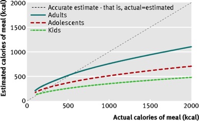
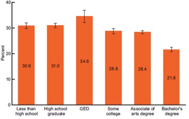
Today’s post is short and in preparation for the fact that many of us eat out more during summer vacation and when we are on the road doing all sorts of different things. The chart below is from a study of more than 3000 people in the New England area eating at national fast food chains. The key finding is that people in every age group under estimate how many calories they are eating when that grab a meal at a fast food outlet.
There is also recent evidence that better labeling reduces the number of calories purchased at fast food restaurants by women and not men. Finally, we tend to eat more when we eat out and the consumption of either pre-prepared food or eating out more are factors contributing to the obesity epidemic. The implications of this data are pretty obvious and start with clear labeling of the food we buy in whatever venue and then paying attention to the labels. Especially for men!
Life Expectancy & Entitlements: Economic Inequality or Behavioral Inequality?
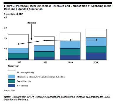
Discussion about the retirement age and reforming Medicare and Social Security spending is likely to be a long term part of the political debate (or is it gridlock) in the U.S. The well respected Economist magazine based in London suggests that President Obama’s legacy is dependent on getting entitlements under control so that the U.S. can spend money on other things. The rationale for this is laid out in the graph below that comes from the most recent projections from the non-partisan and independent Government Accountability Office (GAO). It is the most optimistic scenario in the GAO report. The point is that we are headed to an unsustainable financial situation if Social Security, Medicare and other health spending, along with interest payments by the Federal Government are not brought under control. One way to control these costs is to increase the retirement age to reflect the fact that life expectancy has increased dramatically since Social Security and Medicare started. The primary concern with raising the retirement age is that most of the gains in life expectancy have occurred in better educated people who also tend to have higher or even much higher incomes. So raising the retirement age is seen “unfair” by some commentators.
Health Behaviors Education and Income
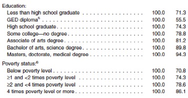
The next three graphics come from a recent CDC report about the state of U.S. heath from 2008-2010. The first is a table that shows the impact of education and income on smoking rates. The column on the right is the percent nonsmokers. Less educated and/or lower income people smoke a lot more than better educated higher income people.
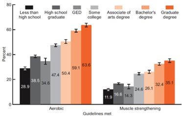
The next two graphs show the impact of education on physical activity and obesity. There is a similar effect of income on physical activity and obesity and as I noted above education and income are highly correlated.
PHYSICAL ACTIViTY vs. EDUCATION
OBESITY (BMI > 30) vs. EDUCATION
What is the Real Problem?
I have discussed this topic before and it seems to me that what is unfair is that aggressive steps are not being taken to address these issues in a comprehensive way for all Americans. A couple of posts ago I showed you what key risk factors alone and in combination did to life expectancy to a cohort from Scotland. From what I can tell each of the key risk factors above is worth about 3-5 years of life expectancy and the data above suggest that on average well educated/higher income people have about 1-2 fewer risk factors than poorly educated/lower income people and that difference explains most of the difference in life expectancy between groups. The other key point is that the risk factors above are independent of access to traditional medical care which may not do much to improve the health of low income people with limited access to health care. There is a lot of denial about all sorts of things in the current political and public policy arenas. Failure to aggressively address key behavioral risk factors for the population as a whole and especially for less educated/lower income people is a good example of just how pervasive this denial is.
How Much Mileage For A Prodigy?
Last weekend there was a piece in the New York Times on 16 year old Alana Hadley who is running more than 100 miles per week in hopes of breaking 2:40 for the marathon. Her story is the most recent chapter in a long running debate about heavy training in general and marathon running in specific for teenagers and even younger kids. I had several e-mail exchanges with Terry Laughlin and Amby Burfoot on the topic and here are some thoughts that might be of interest.
- Is this a good idea? Who knows and who knows what motivates young people to do these things. Everyone worries about parental pressure, but this is probably true for prodigies in any field.
- Would this be a big deal if she were a swimmer, a golfer or a tennis player? These sports are full of teenage girls who have won at the highest levels. Some of the early winners go on to long successful careers while others are one hit wonders.
- There is a general rule of thumb that most people can only really train at the highest level for perhaps 6-8 years. This might be getting stretched with the emergence of financial opportunities, but eventually people get injured or choose to focus on other things.
- For younger runners is it best to focus on shorter distances and move up later? In other words train for the mile or 2-mile (3,000m) and let the longer races come.
- This has happened before. The best example was Wesley Paul who broke three hours when he was 9 years old. Paul still runs but was never world class. The link below is what looks like a pretty good list of year specific records for the marathon.
Don’t forget Gerry Lindgren
In 1964, 18 year old Gerry Lindgren “beat the Russians” in the 10,000m in the USA-USSR track meet held in the Los Angeles Coliseum. At the height of the Cold War this was seen as a David and Goliath like accomplishment. His high school 5k record stood for 40 years and is still probably the best ever if you consider is was run on a dirt track. The brief video clip below shows Lindgren at age 19 breaking the world 6 mile record as he is nipped at the tape by the legendary Billy Mills. Lindgren competed at the 1964 Olympics, and then went on to disappear and appear several more times and is a now you see him now you don’t collection of urban legends. Perhaps the greatest ever and greatest never all wrapped up into one person.
click here for video
Health Guidelines: Are We Making Them Too Complicated?
In an e-mail titled “Too Close For Comfort…..” my Colleague Doug Seals sent me a link of a satire laced piece from the Onion about how hard it is to get people to change their lifestyles based on “studies” and scientific data. This Onion piece also intersects with some of the ideas in my last post related to the frustrating fact that guidelines frequently change as new information emerges. Other colleagues have mentioned to me that the sheer volume of goals and guidelines that are being released are at best confusing. That having been said, here are six health guidelines and ideas that have stood the test of time and are backed by solid evidence that is unlikely to change.
- Don’t Smoke.
- Be physically active and avoid sitting for prolonged periods of time. 150 minutes per week of moderate intensity (brisk walking) physical activity is the key number. If you have even less time, here is a link to a brief high intensity work out you can do with minimal equipment. Physical activity also blunts the impact of risk factors like high blood pressure, diabetes, and cholesterol on your health. In addition to protecting you from cardiovascular disease and diabetes, physical activity is the one thing that seems to reduce the risk and even slow the progression of cognitive impairment as we age.
- Don’t get fat. There are some caveats here but they are subtle and on a population wide basis medical problems associated with body weight really start to take off for people with BMIs greater than 30.
- Eat a bit better. I don’t think most people have to be a fanatic about diet, but watch how much red meat, fried/fatty foods, and sugar you consume. Eat more fruits, vegetables and whole grains. As I recently pointed out, do this and watch the pounds melt away.
- Don’t drink too much. One or two drinks most days are fine and may in fact be good for your overall health. However, more than that is a slippery slope.
- Stay engaged in life. People who have a sense of autonomy over their own destiny and connections with others tend to live longer. A bit of optimism is also a good thing.
Guideline Followers Live Longer and Age Slower
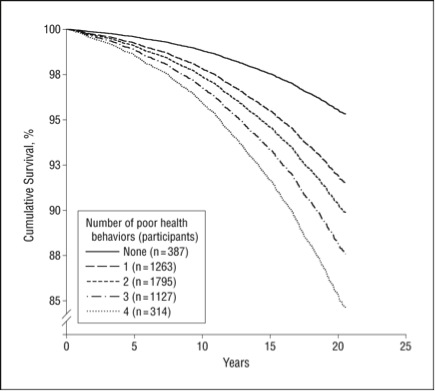
The figure below is from a 2010 paper that looked at the impact of four health behaviors (smoking, physical activity, drinking, diet) on survival over 20 years in about 5,000 adults from England and Scotland. Here are two key points from the paper:
- “Those with 4 compared with those with no poor health behaviors had an all-cause mortality risk equivalent to being 12 years older.”
- “The combined effect of poor health behaviors on mortality was substantial, indicating that modest, but sustained, improvements to diet and lifestyle could have significant public health benefits.”
Summary
What constitutes healthy behavior is pretty straight forward. If we address these six issues as individuals, via public health measures, and implement things like sin taxes and risk adjusted insurance premiums; our individual and collective health will improve dramatically.
Medical Ignorance vs. Dietary Salt and Breast Cancer
Recent news reports have highlighted uncertainty about dietary sodium guidelines and also the diagnosis and treatment of breast cancer. When the breast cancer story came out a friend of mine e-mailed and asked for help in making sense of it all. I want to share parts of my response to her with you and also how it applies to things like the shifting dietary salt guidelines. Here are some things about medical “knowledge” that are not widely appreciated:
- We have the ability to detect “abnormalities” that are at the edge of our knowledge.
- When we detect these things, what do we do…….everything, nothing, something in between?
- There is frequently a bias in medicine to do more. However, every intervention has risks and potential unintended consequences. Where is the balance? How much risk are you comfortable with? How can Drs. explain these nuances to patients?
- Clinical trials are great, but they are average results and the best scientific advice for thousands of people may not be the best for you. For all trials there are responders, non-responders and sometimes even adverse responders. This is especially true for salt and blood pressure. At some level it is a roulette wheel, and all we can do is play the odds.
- Progress against cancer, especially solid tumors, has been really slow. There are lots of reasons for this including the idea that there are metastases by the time things are detected. There are also issues related to basic tumor biology and how fast tumors grow vs. the toxicity of drugs for other tissues. Finally, tumors have a tremendous ability to adapt and work around drugs.
- We are trapped in cycles of relative ignorance, over simplified dogmatic responses, followed by more insight. For example the current idea is that when we can genetically finger print individual cancers “cures” will flow from this knowledge. A more sober interpretation might be that we will be able to pick and develop better drugs for each individual and improve the odds of a better outcome (note I did not say cure).
- Disease advocacy groups are wonderful, but sometimes the culture of disease advocacy leads to sound bited messages for really complex things.
- Things in a number of areas of medicine that had pretty hard core guidelines when I started medical school in the early 80s (for example how we treat heart attack and heart failure, and how we set the ventilators in the intensive care unit) have evolved or even changed 180 degrees since that time. Outcomes are better but these sorts of sea changes are challenging for everyone. This happens all the time.
As a result of all of these things (and more) there are lots of educated guesses in medicine. There is also tension related to research and the need to make “constructive mistakes” to further knowledge and offering people “error free” state of the art care, with the ambiguous caveat that the state of the art changes. At some level, the more we know the less we know.
Exercise vs. Global Warming: Gradually Then Suddenly?
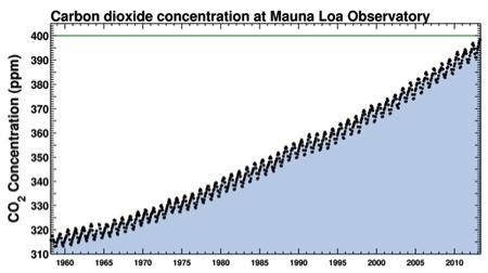
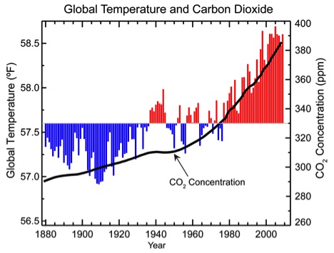
In early May atmospheric CO2 reached 400 parts per million (PPM). This was seen as a major milestone in global warming and a harbinger of more bad news to come. The figures below are for atmospheric CO2 since the late 1950s and the relationship between atmospheric CO2 and global temperature since 1880.
Climate Change Skeptics
There is skepticism about the reality of climate change and the extent to which it is being caused by human activity. Some of this is highly political and driven by all sorts of other considerations, notably money and power. However, on balance the weight of scientific evidence favors a major role for human activity in global warming and I find the arguments for this position much more convincing than the arguments against it. I am a physiologist/physician not an ecologist, economist, or atmospheric physicist, so what do I have to add?
Gradually Then Suddenly!
With that question as a background, here is what a physiologist has to add along with the relevance of Hemingway’s famous lines about bankruptcy in “The Sun Also Rises”:
“How did you go bankrupt?’ Bill asked. ‘Two ways,’ Mike said. ‘Gradually and then suddenly.’
Gradually then suddenly describes a lot of things in physiology and biology. For example when people stand up the blood pools in their legs away from the heart and this tends to make blood pressure fall. In response the nervous system constricts the blood vessels and increases heart rate to keep blood pressure normal. This works well, but only for a while. If people stand up for too long eventually the responses noted above “fail” and most of us will faint suddenly. The video clip shows some examples of just how fast this can happen.
click here for video
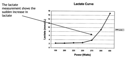
Another good example of gradually then suddenly comes from exercise physiology. As people go from rest to mild or moderate exercise the lactic acid levels in their blood do not increase much and then the levels start to rise a lot as they go harder. The figure below shows an example of what is seen during an exercise test in an elite athlete.
Exercise Metabolism vs. Earth’s Metabolism?
The exercise example is perhaps a good analogy for climate change. Our ability to sustain exercise for prolonged periods of time starts to drop at exercise levels above the lactate threshold. Metabolism ramps up and not much happens for a while and then a lot happens above the “lactate threshold” that can limit exercise duration. In healthy young people metabolism can increase 5-6 times above rest without too much difficulty. In elite endurance athletes, metabolic rate can increase perhaps 15 times above rest before things get too out of balance. If we think of global CO2 production as a form of metabolism then perhaps the earth as an organism can adapt to pretty dramatic increases without much happening. The figure below shows what has happened to global CO2 production since industrialization. Who knows exactly where the Earth’s CO2 climate threshold might be, but if we take the value at around 1900 as “baseline” we are above the 5-6 fold increase in metabolism that can be tolerated by untrained people. It also looks to me like we are getting close to the 15 fold increase that can be tolerated by elite endurance athletes. How much farther do we dare push these curves before something really dramatic happens to the environment over a short period of time?
The Price of Denial
In my last post I pointed out that as the developing world gets richer and older there will be even more pressure on resource consumption and energy use. In rich countries like the U.S. denial about the implications of aging for things like Medicare and Social Security is leading to political gridlock, a lack of creative solutions, and long term financial choices that are not pretty. The same is true for Earth as a whole when it comes to denial about climate change and the human factors driving it. When has denial ever been a good policy option?
More Demographic Reality!
In the post a couple of days ago I tried to give you some big picture information related to world population trends and aging. This is part of my ongoing “educational campaign” for demographic reality related to how we approach the world as individuals, organizations, and countries. Today I want to share to more graphs with you about how unprepared we are for the future of the world.
Population Growth 1750-2050
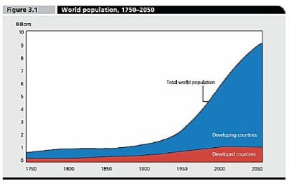
The figure below shows both historical and projected increases in population. Currently there are about 7 billion people on earth and that number is projected to rise to about 9 billion by mid-century and then perhaps level off. All of the projected population growth is likely to happen in the developing world. No population growth or a slight decline is projected in the developed countries of Europe, North America, Japan, and Australia/New Zealand. In 2050 there will be 8 billion people in the developing world.
What Happens When They Get Cars?
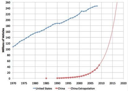
The next figure shows the number of vehicles (essentially cars and trucks) in the U.S. and the number of vehicles in China along with the projected growth in China over the next few years. I picked this slide because people from all over the world want cars when they “join the middle class”, and my bet is that cars are a pretty good marker for consumption of other energy and resource intensive items like refrigerators, TVs, personal computers, meat and microwave ovens. So even if the graph below over estimates the rise in car ownership in China (if anything it is an underestimate), what will the impact on world resource use be if a couple of billion more people join the middle class between now and 2050?
Thoughts About These Trends
I don’t begrudge anyone the desire to live a middle class developed world life with cars and other gizmos. To say folks in the developing world should fundamentally not have what we have seems hypocritical at best. So do we severely downsize and conserve in the developed world? Do we all become vegetarians, ride our bikes, live in small houses, and take public transportation? Even if we all cut our consumption of “stuff” by 50% or more, how long will it be until this level conservation is overwhelmed by the sheer number of people living “better” in the developing world? Are we headed towards some sort of total environmental and economic collapse, or should we start to discuss a combination of conservation, mitigation, and lesser of two evil choices (like nuclear power) to avoid collapse? If so what are the options and who decides? At some level we can compete country by country and face almost certain collapse, at another level we can collaborate creatively and perhaps get by. We should also keep in mind the words of Arnold Toynbee as we think about the future:
“Civilizations die from suicide, not from murder”
The Aging World in 3 Graphs
I was talking to some healthy and vital colleagues in their early 60s about retirement and “warned” them to be careful about how soon they retired because as health guideline followers, they would likely live many, many more years. For my friends the issue is not financial security, but the stimulating nature of their jobs, and their roles as mentors/teachers and super skilled physicians. From my perspective the “aging world” is one of a couple main drivers of the challenges facing us all including the political and financial issues related to budgets, debt, and health care costs. This is true both for the United States and the rest of the world as well. That having been said, I want to show you three graphs about the history of aging.
Nothing Changed Until the Industrial Revolution
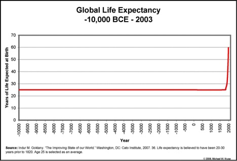
The first graph is from a book “The Improving State of the World”. It shows that for most of human history life expectancy was pretty static and nothing really changed until the industrial revolution starting in the 1700s. The extent to which the industrial revolution and the invention of the steam engine “caused” life expectancy to rise is unclear. During that time frame “modern” ideas about sanitation, nutrition, improved agriculture, public health etc. started to emerge as well. So a lot was happening related to the development of the world we live in today.
Population Pyramids and Scotland
The second graph is shows the population vs. age structure of Scotland. I chose Scotland because this figure is a typical example of what has happened in the developed, “rich” parts of the world over the last 100 plus years and this graph was especially well done. In 1911 there was a classic population pyramid with a lot of young people and very few older people. As infant mortality and other things that kill young people were conquered over the next 40 years, the base of the pyramid had really changed by 1951. By 2001 there were as many or more middle aged than young people. The wide “waist” of the pyramid associated with the baby boom will also swell the growth of people over 65 by 2031. This figure also shows that more women make it to old age than men. The implications of these shifting pyramids for things like the ratio of workers to retirees, health care costs and pension costs are immense. Here is a link to a Wiki site on the whole topic of population pyramids.
The Future & Population Pyramids
The final graph is from Australia and shows what is projected happen to the population pyramid there over the rest of the century. The projected data is superimposed over the 1998 data. Again, these trends are pretty typical for the developed world and similar trends are starting to emerge in places like China and other developing countries. They clearly demonstrate that the cultural, political, and financial discussions we are currently having about the aging population are going to continue. The massive rise in the top part of the pyramids (people older than 80 or even 90) is likely to be especially challenging.
Demographic Reality?
You can look at these graphs, especially the last two, all sorts of ways. However, it seems to me that as individuals, cultures, countries, and “the world” we need to have a serious conversation about what policies make sense given the coming demographic reality. For example, should the retirement age remain 65? What are reasonable expectations to place on young people for support of the “old” as the population structure changes? How should pensions and social insurance programs be structured? There are many nuances to these questions but the fundamental demographic issues are unlikely to change.
You are currently browsing the Human Limits blog archives for May, 2013.

